A few plots to compare with M. Kerr's results
from nbdev import *
!date
This notebook generates plots for two of the sources that he examined, and compare with figures from the Kerr paper.
Note the use of ipynb_docgen allowing a cell to create a document mixing markdown and plots. Each of the plots
below is displayed as a link to an attached file, and can be clicked on to see the orginal.
from wtlike import *
from utilities.ipynb_docgen import *

def kerr_test():
    r"""

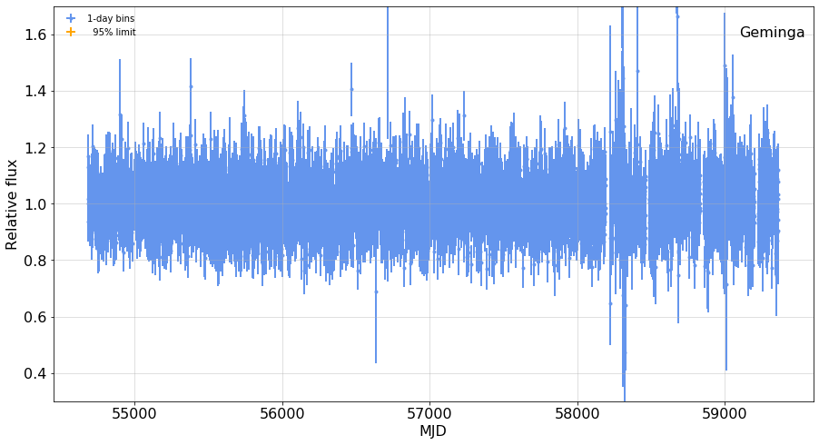
    ### A bright pulsar, {lc1.source.name}:
    {print_out1}
    {fig1}
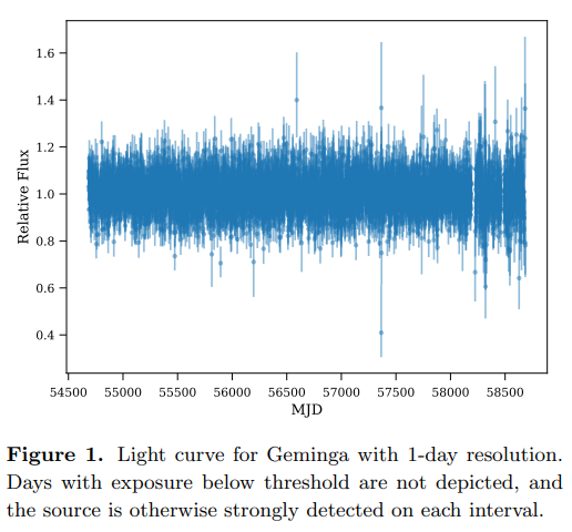
    This is to be compared with Kerr's Figure 1:
    {kerr_fig1}

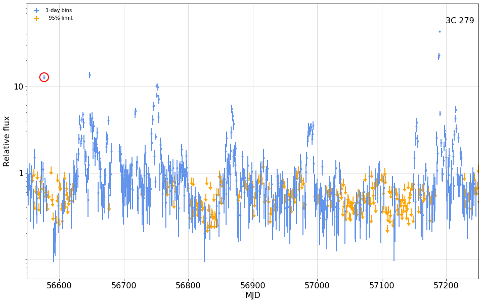
    ### A flaring AGN, {lc2.source.name}
    {print_out2}
    {fig2}

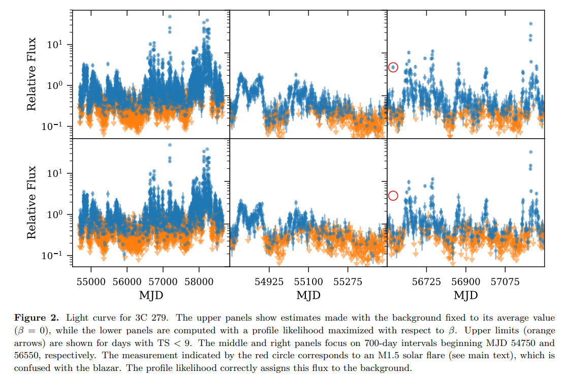
    This corresponds to the upper right panel in Kerr's Figure 2.
    {kerr_fig2}
    The Kerr paper discusses the circled point at MJD {flare.t}, during which the measured flux was
    dominated by a nearby intense solar flare. The lower panel shows fits that were marginalized over $\beta$.

    """

    plt.rc('font', size=16)


    with capture_print('output from this analysis') as print_out1:
        lc1 = WtLike('Geminga', time_bins=(0,0,1))
        fig1 = figure(
                    lc1.plot(fignum=1, figsize=(15,8),colors=('cornflowerblue', 'orange'),
                             ylim=(0.3,1.7), ts_bar_min=4,),
                    caption=None,   width=500, )

    kerr_fig1 = image('kerr_fig1.png', width=300, caption='Kerr Figure 1')

    with capture_print('output from this analysis') as print_out2:
        lc2 = WtLike('3C 279', time_bins=(0,0,1))
        flare= lc2.fluxes.loc[1893]

        fig2 = figure(
                    lc2.plot( fignum=2, figsize=(16,10), yscale='log' ,
                          colors=('cornflowerblue','orange'), ts_bar_min=9,
                         xlim=(56550, 56550+700),   ylim=(0.06,90)),
                    caption=None, width=500, )
        ax = fig2.axes[0]
        ax.scatter(flare.t, flare.flux, s=300, facecolors='none', edgecolor='red', lw=2,
                   label=f'Solar flare at {flare.flux}');
    kerr_fig2 = image('kerr_fig2.png', width=500, caption='Kerr Figure 2')

    return locals()


nbdoc(kerr_test)
lc2 = WtLike('3C 279', time_bins=(0,0,1))

cell= lc2.fluxes.loc[1893];
flare = lc2.view(56570, 56580,1)
flare.plot(tzero=56576);

flare.fluxes

flare.fit_beta_free();


